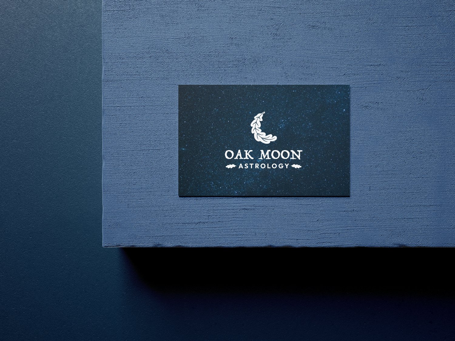
Oak Moon Astrology
A rebrand for a local Astrologer who wanted a logo that felt natural and simple. Something that set them apart from clichés.

The logo
After settling on an icon of an oak leaf crescent moon, I decided to opt for a font that united the hand-drawn style of the icon with the rest of the logo. The result feels cohesive, with a slightly rustic, natural aesthetic.


